
The Visual Magnet: How to Earn High-Authority Backlinks Without Asking
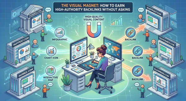
Most digital marketers get stuck in a frustrating loop—sending cold emails, asking for backlinks, and waiting for replies that rarely come. It’s a strategy built on interruption, not value, which is why the success rate is painfully low. But the real shift happens when you stop thinking like a requester and start acting like a creator. Instead of asking, “Can you link to me?”, you ask, “How can I make your content better?” This is where the Aha! moment changes everything. By creating a high-quality infographic or motion clip that enhances someone else’s article—simplifying complex ideas, visualizing data, or improving storytelling—you position yourself as a contributor, not a solicitor.
This approach works because visual content is naturally more engaging, easier to understand, and highly shareable compared to plain text. When you provide something valuable, site owners are far more likely to accept it and credit you with a backlink, because you’re improving their user experience, not asking for a favor. In fact, infographics are known to attract high-quality backlinks since they condense useful information into digestible visuals that others want to reference and share . Over time, this “give-first” strategy builds authority, trust, and organic links—turning outreach from a desperate chase into a smart, value-driven collaboration
Bloggers don’t just write for information—they write for perception, authority, and retention. The psychology behind every blogger is simple: “Does my content look valuable enough for someone to trust and stay?” Within seconds, a reader decides whether a post is worth their time, and that decision is heavily influenced by how the content looks, not just what it says. In fact, users judge credibility almost instantly based on visual presentation, and strong design directly impacts whether they continue reading or leave . Since the human brain processes visuals far faster than text, bloggers naturally want their posts to feel clean, professional, and easy to consume—because that’s what keeps readers on the page longer and reduces bounce rates .
This is where the “Visual Summary” strategy becomes powerful. When you take a complex topic—like a spam score checklist or a digital growth roadmap—and convert it into a clean, engaging visual, you’re doing what most bloggers struggle to do: simplifying complexity. Infographics and visual content make information easier to understand, increase engagement, and can even double content shares compared to text-only posts . More importantly, they naturally extend dwell time because users spend longer exploring visuals than reading plain text .
The real magic is in the outcome. Bloggers are constantly looking for ways to improve their content quality without extra effort. When you provide a high-quality visual summary, you become a solution to their problem. Instead of writing their own explanation, they embed your graphic to enhance their post. And because your visual adds value, they credit you with a backlink. This is why infographics are considered “link magnets”—they attract backlinks organically because other creators want to use and share them . Over time, this creates a powerful system where your content spreads across the web, builds authority, and increases your Domain Authority—without constant outreach—essentially earning links even while you sleep.
Data may be the currency of the internet, but in its raw form, it’s overwhelming, lifeless, and easy to ignore. Endless spreadsheets and statistics don’t tell a story—they create friction. That’s why visualization becomes the real power move. By transforming complex trends—whether it’s the digital shift in the dairy industry or the growth of a brand like Milknest—into a clean, compelling chart, you turn boring numbers into insight. Data visualization works because it simplifies complexity, highlights patterns, and makes information instantly understandable, allowing audiences to grasp key takeaways without effort .
The real hook lies in how this content is consumed and shared. Journalists and high-authority websites are constantly searching for credible, easy-to-use data that enhances their stories. A well-designed chart does exactly that—it communicates complex information quickly and clearly, making it ideal for storytelling in media. In fact, data visualization is a core tool in journalism because it helps present insights that are difficult to explain through text alone . When your chart becomes the easiest way to explain a trend, it naturally gets cited. And every time it’s embedded, you earn a backlink—not by asking, but by becoming the source. That’s why one powerful, original chart featured on a major site can outperform hundreds of low-quality links, building authority, credibility, and SEO value in a way that scales effortlessly over time.
4. Technical Trust: Keeping the “Neighborhood” Clean
Even if your visuals are high-quality, your SEO can quietly suffer if you don’t control where and how they are used. When your graphics get picked up by low-quality “link farms” or image scraper sites, they may generate backlinks—but the wrong kind. These sites often lack credibility, and being associated with them can dilute your trust signals in Google’s eyes. Search engines don’t just look at how many links you have; they evaluate who is linking to you. If your content is surrounded by spammy domains, it can weaken your perceived authority instead of strengthening it.
That’s why monitoring and protection become essential. By tracking who embeds your visuals, you can identify valuable placements versus harmful ones and take action if needed. At the same time, strengthening your own website’s credibility is just as important. Clear About and Contact pages act as trust signals, helping search engines understand that a real, knowledgeable person or brand is behind the content. This directly supports the concept of E-E-A-T (Experience, Expertise, Authoritativeness, and Trustworthiness), which Google uses to evaluate content quality and reliability .
In simple terms, backlinks alone are not enough anymore—trust is the real currency. By protecting where your visuals appear and proving who you are, you turn your content from just “shareable” into something search engines see as credible, authoritative, and worth ranking.
5. Conclusion: Design is Your SEO Shortcut
Building a digital reputation isn’t a quick win—it’s a long game. But when you use visual storytelling, you’re not just running the race… you’re running it with an edge. In a world flooded with content, attention is the real currency—and visuals grab it instantly. The brain processes images far faster than text, making your message easier to understand, remember, and act on . That’s why visual content consistently dominates—earning up to 94% more views and significantly higher engagement than plain text posts .
This means one thing: while others are writing… you’re communicating.
Why this strategy works (and scales)
Visual content doesn’t just look good—it performs. Infographics and motion visuals break down complex ideas, increase dwell time, and make content highly shareable. Research shows infographics are 30x more likely to be read and significantly more shareable than text-only content .
Even more powerful? They naturally attract backlinks. When your visual simplifies valuable data, other creators embed it—and credit you. This creates a passive link-building system where your content keeps working long after publishing. In fact, data-driven visuals can generate up to 50% more backlinks than traditional content .
And here’s the real leverage:
It gets shared.
It gets embedded.
It earns links.
No chasing. No begging. Just pull-based authority.
Call to Action (CTA)
“Are you tired of sending link requests that go into the spam folder?
Comment ‘VISUAL’ below, and let’s brainstorm one infographic idea that could transform your site’s authority!”
Visual Suggestion (Make your post pop)
Embed a 15-second “Before vs After” motion clip:
Start: A dull, text-heavy blog (low engagement )
Transition: Content transforming into visuals
End: Clean infographic + motion design (high engagement )
This doesn’t just tell your message—it proves it visually, which is exactly why this strategy works.
Final Thought
The “Visual Magnet” angle isn’t just a tactic—it’s a long-term authority engine. It aligns perfectly with modern content consumption: fast, visual, and value-driven.
If you want quick traction → go Visual Magnet.
If you want deeper control → we can break down Spam Score cleanup next.
Your move: VISUAL or SPAM SCORE?